Mobile App Design
Health Care
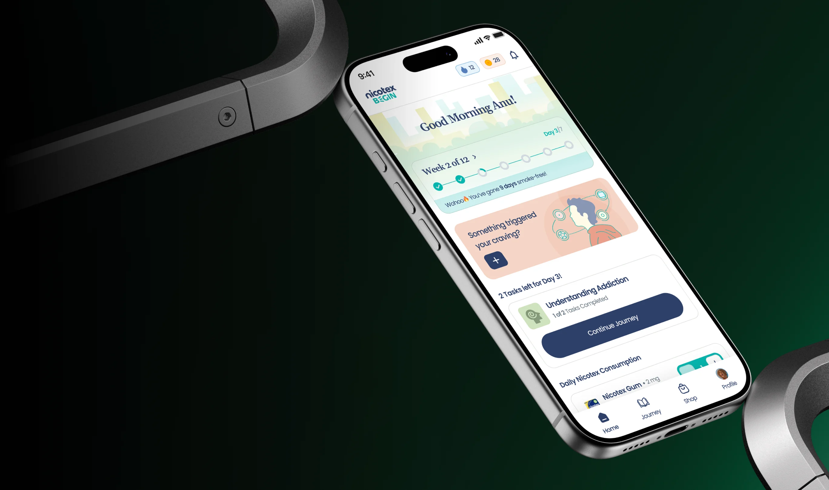
Groto redesigned the mobile experience to simplify onboarding and help users begin their tobacco-free journey.
Mumbai, India
36 weeks
Figma, FigJam, Notion, Google Meet
The Client
Nicotex Begin is a 12-week digital smoking cessation program by Cipla Health that combines Nicotine Replacement Therapy (gums, patches, lozenges) with behavioral counseling, daily tracking, and educational content. The mobile app plays a key role in guiding users through both nicotine dependence and behavioral addiction, supporting them throughout their quitting journey.
Creative Challenges
Despite strong clinical foundations, the existing app experienced drop-offs during onboarding, with users often unsure about next steps. The experience felt overly instructional and lacked reassurance, which is critical for users attempting to quit smoking and needing confidence in the early stages of the program.


Our Approach
We focused on simplifying the experience and making it feel more supportive and confidence led. Our approach centered on reducing cognitive load, clarifying user actions, and ensuring that users always knew what to do next, especially during onboarding and daily usage.

What We Did
We simplified the onboarding flow, clarified daily tasks and NRT guidance, and improved content hierarchy across the app.
The redesign shifted the experience from a purely instructional flow to one that balanced clear guidance with emotional reassurance.


Design Process
We began by auditing the existing app and mapping key user flows to identify friction points, particularly during onboarding and early usage. These insights informed simplified wireframes and a redesigned UI in Figma, with regular client reviews to refine structure, tone, and usability. Internal usability reviews then helped surface confusion around copy and key actions, leading to clearer language, more explicit CTAs, and the removal of unnecessary information in early-stage flows.

Testing & Iteration
Testing highlighted early-stage confusion and information overload. To address this, we introduced progressive disclosure, simplified the quit journey into clearer steps, and refined visual hierarchy and CTAs to better guide users through onboarding and early use.

Key Insight
A key insight from the project was that users needed constant reassurance, not just instructions. Designing for emotional confidence proved just as important as designing for functional clarity in supporting behavior change.


The Result
The redesigned app now offers clearer onboarding, more structured daily guidance, and a more encouraging user experience, setting a stronger foundation for long term engagement and quitting success.
FAQ
We’ve heard it all. Here’s everything you need to know before working with us.

